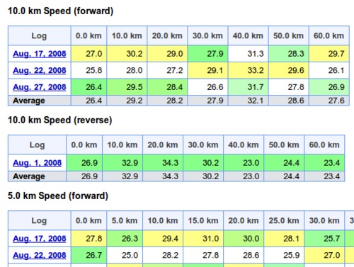
Distance split comparison table for routes
I've added a new tab to the route detail page in GPSLog Labs that compares the distance splits for all logs in the route.
This allows you to see the speeds over each section of the route for each log. Each column is coloured to indicated min/avg/max in white/green/yellow respectively. This allows logs that are faster or slower than normal to be easily identified.
For routes that display pace instead of speed, the pace over 1km (or mile) is displayed, i.e. for longer splits, it is not the time to cover the whole split distance.
| ← Previous post | Next post → |
