GPSLog Labs Blog

GPSLog Labs Blog

New features and tips for using gpsloglabs.com

Filed under

graphs

Goal predictions

I've just enhanced the GPSLog Labs goal overall progress graph so that it now shows a prediction of the likely result based on what you've achieved so far (hopefully that's motivating, not depressing!)

It feeds your past past weekly totals into a Monte Carlo simulator to come up with a range of possible outcomes which are added to the graph. The fainter gray lines show the upper and lower estimates, while the darkest gray lines are along the 1st and 3rd quartiles (i.e. 50% of the predicted outcomes will fall between those lines.)

This will work best for longer term goals, since it's using weeks as the unit of time, please let me know if it's not working well for your goals and I'll see what I can do.

Filed under  //  changelog   goals   graphs  

Heart rate logging

Support for heart rate logging in GPSLog Labs has been added for Garmin devices that use the Garmin Training Center format (i.e. .TCX files).

You can see graphs of your Heart Rate vs Time and a histogram of your heart rate on the activity detail page:

Heart rates will be repeated to fill in gaps if the readings occur less than once per second, up to a maximum of 5 minutes.

If you have a device that logs heart rates, and the graphs aren't showing up in GPSLog Labs, please let me know and I'll add support for it.

Note that this will only work for logs out doors where a latitude and longitude is recorded with the heart rate, so if you're using something like a Garmin EDGE705 in indoor mode, you won't be able to view your activity or heart rates.

If you don't have a GPS logger that records your heart rate at each point, you can still record average and maximum heart rates against your activity manually (i.e. based on a non-logging heart rate monitor strap.)

To switch heart rates on manually:

  1. Go to tags, and select a tag you want to record heart rates for (e.g. Running or Bike)
  2. Edit the tag, click the "Edit heart rates" checkbox.
  3. Now, when you go to activity tagged with that tag, you'll see the "heart rate" tab (this usually only shows up if your logger supports heart rates.)
  4. On that tab, the average and maximum heart rate values will show "edit", click that, type in the heart rate and click the save button.
    Heart_manual_1

Once the system has heart rates recorded against your activity (either automatically or entered manually) they will show up in summary and comparison tables and graphs for routes and tags.

Filed under  //  changelog   devices   graphs   heartrate  

Embedding maps and graphs in your site

In addition to sharing GPSLog Labs content via Twitter, Facebook, email and IM, another option is to embed maps and graphs of your activity in your own website.

To do this, you'll need to enable sharing for the content and then you'll be provided with a snippet of HTML you can cut and paste into your own website.

For example, to embed a map, you'll see the following on the Share Log page:

You can customize the size of your map and the whether you want stop icons to be drawn or not. You'll see a preview on the right and when you're happy with it you can cut the generated HTML code and paste it into your website. To embed a graph of your activity, follow the same steps.

Tip: It is possible to customize the size of the embedded map if the standard sizes are not appropriate by editing the HTML and adding &width=1234&height=1234 to the iframe src url, and also updating it's width and height attributes to match.

Note that if you Disable sharing for your activity, it will no longer be visible on your site, even if you re-enable sharing again as the secret URL will be different.

Filed under  //  changelog   embedding   graphs   maps   sharing  

Sharing your logs

By default all the activity you upload to GPSLog Labs is private and visible only to you.

If you want to share maps and graphs of your activity with your friends click the Share button to enable sharing:

Screenshot-sharing-1

Then click the Enable sharing button:

Screenshot-sharing-2

This will generate a publicly accessible detail page:

Which will look like this (actual link):

You can share the URL to this page on Twitter, Facebook, email, IM or wherever you like, for example, clicking the Share on Facebook link will open a window which will let you customize a message and publish a link to your activity on your Wall:

At any time, you can click the Disable sharing button to hide the activity if you change your mind.

Any shared content will be indicated by a "sharing" icon

Shared

and will be listed on the Shared tab so you can review it.

I'll be adding the ability to share more kinds of content soon but if you have anything you'd like to see in particular, please let me know.

Filed under  //  changelog   facebook   graphs   maps   sharing   twitter  

New GPS Track Filters

GPSLog Labs now has a powerful and customizable filtering feature to clean up errors in your logs caused by bad GPS signals.

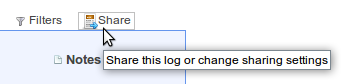
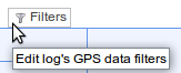
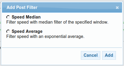
There is a new menu option on the log detail page that will let you edit the filters applied to that log:

Screenshot-filter_menu

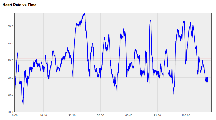
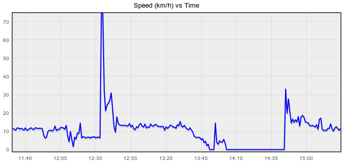
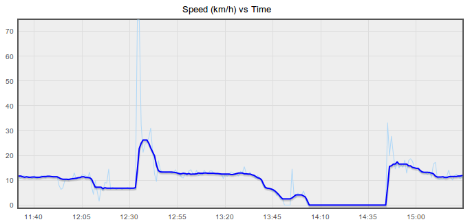
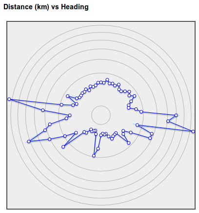
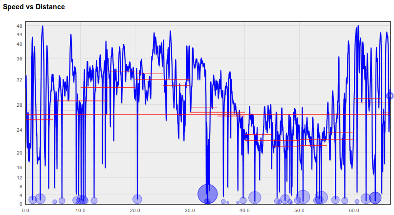
The following graph comes from a log recorded while running and shows the kind of noisy data that is often present. The incorrect speeds mess up the maximum speed, average speed and distance stats and often correspond to a bad trace on the map too.
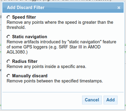
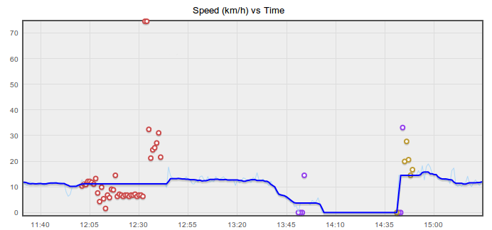
Discard filters

The first filters you can choose from will discard invalid points from your log and then interpolate the speed and course between the remaining points.

Screenshot-add_discard

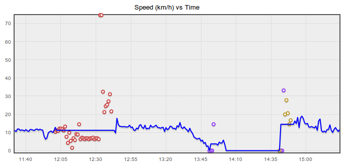
After applying those filters, the speed vs time graph looks a lot better (discarded points are colour-coded to match up with the chosen filters):

Post filters

The second filtering stage applies an average function to the newly cleaned up data. Smoothing the speed graph will give you a more reliable average and maximum speed statistic and also improve the distance and time split data, but won't clean up the trace on the map or affect the total distance.

Screenshot-add_post

The original speeds are shown on the graph below as a light blue line, and after applying a median filter, the thick blue line has been smoothed (no discard filters were applied for this graph).

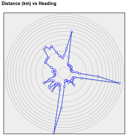
This graph shows the final results when both discard and post filters are applied:

Existing logs

The new filters will only take affect for new uploads, existing logs will retain the data from the old filter that GPSLog Labs used to apply until they are reprocessed.

Also, the discarded points from the old filter will no longer be shown on the Speed vs Time graph on the log detail other graphs tab. This information is only available now for logs using the new filter system from the Filters menu item.

Try it out

I suggest using a simple Speed Median filter initially, as that will clean out a lot of noise, setting the window time parameter to a larger value will smooth the speed more. I'll be describing the other filters in future posts.

As always, let me know if you have any difficulties or suggestions, and I hope this new feature helps you get more out of the site and your GPS logger!

Filed under  //  changelog   filters   graphs   stats  

Updates for September 10th

This post outlines a few of the recent updates to GPSLog Labs:

  • I've added a new menu to the uploaded log files in the Inbox confirmation stage. This allows you to quickly perform tasks on the uploaded log file should you need to by simply moving the mouse over the log file heading:
  • Graphs now shade the middle two quartiles of the data, instead of showing +/- one standard deviation, where the distribution is not Gaussian. i.e. everywhere except distances along a single route. Blame Nassim Nicholas Taleb.
  • There's a Battery Cycle Duration vs Date graph on the device's Battery Life Graph tab as I was curious to see if my batteries might be deteriorating with age (they're not yet.)
  • There's a new Total Stop Time vs Date graph on the route detail Stops tab. This can show you if your amount of stopped or resting time is changing over time.
  • Goal graphs now have a dot showing the required amount to meet your target in the remaining time. The lines show the overall average so far (blue) and the average target required (orange), the dots reflect what you need to do per week/month to meet the target based on what you've done so far and how much time you have remaining:
  • Goals are now shown on the week's activity "dashboard" on home page. This lets you see at a glance how you're tracking against the goals and plan what to do next:
    Goal_homepage
    This shows: the goal title, the difference between your actual activity and the goal target to date, the total activity counting towards the goal this week, a percentage comparison to the weekly target.
    Under the total goal activity for the week are coloured indicators to show what day the activity occurred on. The most recent day is on the right in green, the oldest in orange on the left.
Filed under  //  changelog   goals   graphs   inbox  

Route wind effect prediction

There's a new Wind Effect graph on the GPSLog Labs route details Other Graphs tab.

This graph attempts to quantify the effects of wind from different directions on logs along a route. It is intended to assist you to choose a route when bike riding (either to minimise the effect of the wind or to maximise it if you're keen!)

There are 4 lines plotting the relative effect on the overall average speed for the route for different wind strengths. The units are relative and indicative only.

For example, for a log such as the following (predominantly traveling in an east-west and west-east direction):

Route-wind-effect-1a

The computed Wind Effect indicates that the greatest effect will be when the the wind is from the east or west, and the minimum when the wind is from the north or south:

For a route which has a less symmetrical profile, with long sections traveling east and south:

Route-wind-effect-2a

The computed wind effect is more even, but there is a definite advantage when the wind is coming from the west:

The wind model used is pretty primitive and assumes that a headwind has the same effect on your speed as a tailwind, but it's better than nothing. If anyone knows of any more sophisticated models that could be used, I'd be happy to look into it.

Filed under  //  bike   changelog   graphs   routes   wind  

Updates for 22nd August

This post outlines a few of the recent updates to GPSLog Labs:

  • The average speed is now displayed for each 10km, 5km and 1km on the Speed vs Distance graph for a log. Likewise, for 10 minutes, 5 minutes and 1 minute on the Speed vs Time graph. As for the Splits, a maximum of 50 of these averages will ever be shown so the graph doesn't get too crowded.
  • The in page help has been changed so that the "bubble" now minimizes to a little blue question mark icon off to the right hand side of the page. This makes it easier to view it again if you need to get some help on something in particular on the page.
Filed under  //  changelog   graphs   help  

Update summary for 20th August 2009

This post outlines a few of the recent updates to GPSLog Labs:

  • I've added a "single page view" for a log that shows all the maps, graphs and tables that would be on separate tabs on a single page. This is best used for printing out the details of an activity as a PDF file (using something like PDFCreator) so they can be shared with other people.
  • I've improved the support for printing of pages (removing unnecessary borders, headers etc.)

    The best printer settings in FireFox appear to be about a 75% or so zoom, select "print background colours" (to show colours in tables of stats). You can also switch off headers and footers to clean up the output.

    In Internet Explorer, switching on printing of background colours and images is also necessary.

    Printing in Opera isn't really working. Graphs won't print, and the paths on maps don't print either.

  • There is a new Seasons tab on the tag detail page that shows a table breaking down the activity for that tag by time of day and month of the year. This can be used to see how your activity varies with the seasons.
    Tag-seasons
  • New battery change selection page. When a battery cycle goes over 75% of the average for a device, a warning link on the home page will appear. There is a new page to allow easily selecting the point when batteries were changed or charged.
  • A summary of the current status of your goals (if you have created any) is now displayed in a "dashboard" on the home page.
  • Download graphs: Graphs now have a little "save" icon that appears when you hover over them with the mouse. Clicking this will download the graph as a PNG file. Unfortunately, this won't work in IE and the graph doesn't include the labels and legends, so it's not all that useful.
Filed under  //  batterycycles   changelog   graphs   printing   stats  

Internet Explorer 8 supported

After far to much trouble tracking down weird JavaScript errors and testing using an IE8 virtual machine, GPSLog Labs has been made IE8 compatible. If you're using IE8 and still notice any issues with the graphs or maps, please let me know.

Update: Ok, so the graphs don't work so well in IE. If there are a lot of points in a log (more than about an hour's worth), the graph may not draw properly. This is a bug in the library used to provide <canvas> support for IE. If you select a smaller range on the graph to zoom in then it'll show the graph data.

Filed under  //  graphs   ie8   internetexplorer   maps  
← Newer posts Older posts →

© 2013 Tom Paton | GPSLogLabs.com | Source | Feedback | RSS | Subscribe