Updates for September 10th
This post outlines a few of the recent updates to GPSLog Labs:
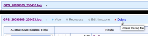
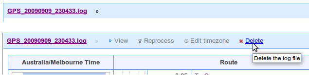
- I've added a new menu to the uploaded log files in
the Inbox confirmation stage. This allows you to
quickly perform tasks on the uploaded log file should you need to
by simply moving the mouse over the log file heading:
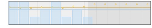
- Graphs now shade the middle two quartiles of the data, instead of showing +/- one standard deviation, where the distribution is not Gaussian. i.e. everywhere except distances along a single route. Blame Nassim Nicholas Taleb.
- There's a Battery Cycle Duration vs Date graph on the device's Battery Life Graph tab as I was curious to see if my batteries might be deteriorating with age (they're not yet.)
- There's a new Total Stop Time vs Date graph on the route detail Stops tab. This can show you if your amount of stopped or resting time is changing over time.
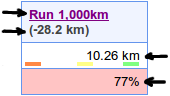
- Goal graphs now have a dot showing the required amount to meet
your target in the remaining time. The lines show the overall
average so far (blue) and the average target required (orange), the
dots reflect what you need to do per week/month to meet the target
based on what you've done so far and how much time you have
remaining:
- Goals are now shown on the week's activity "dashboard" on home
page. This lets you see at a glance how you're
tracking against the goals and plan what to do next:
This shows: the goal title, the difference between your actual activity and the goal target to date, the total activity counting towards the goal this week, a percentage comparison to the weekly target.
Under the total goal activity for the week are coloured indicators to show what day the activity occurred on. The most recent day is on the right in green, the oldest in orange on the left.

| ← Previous post | Next post → |